
Machine learning runs on data. Full stop. Before any model can predict anything, spot a pattern, or automate a single decision, the people building it have to actually understand what’s in front of them first. Visual representation is, hands down, one of the easiest ways to get there. And out of all the tools available, strip chart statistics still earn their place ,they’re great for reading data distribution and catching trends buried inside AI datasets.
AI keeps pushing into every industry you can think of, and because of that, more professionals want a way to do AI data analysis that doesn’t require wading through complicated charts. A strip chart graph fixes that problem pretty directly: it lays out individual data points so you can read them at a glance, no decoding required.
So that’s what this piece is about ,how strip chart statistics get used in machine learning, why they haven’t gone out of style in modern data science, and how they sharpen the decisions made while building AI systems.
Understanding Strip Chart Statistics
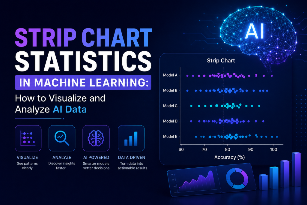
A Strip Chart Statistics is exactly what it sounds like: a way to plot individual observations in a dataset. Histograms group things into bins, but a strip chart doesn’t do that it puts every single data point on the axis by itself. Nothing gets bundled together, nothing gets lost to aggregation.
In machine learning specifically, this matters because strip chart data tends to surface things that would otherwise hide in plain sight. Clusters, gaps, trends, outliers ,the stuff that, left unchecked, can quietly tank a model’s performance.
Here’s a simple case: imagine a dataset with customer ages from 18 to 70. Plot it on a strip chart and every age shows up on its own. Suddenly it’s obvious if there’s a weird entry, a duplicate, or some lopsided imbalance you wouldn’t have caught otherwise.
Models are only as good as the data feeding them, so understanding that underlying distribution tends to be one of the first real steps in any project that’s going to go somewhere.
Why Data Visualization Matters in Machine Learning
Think of data visualization as the translator between raw numbers and anything actually useful. Before training kicks off, analysts need a read on what the data is saying.
Good visual tools answer questions like:
Are there outliers in the dataset? Is the data evenly distributed? Are there missing values anywhere? Do the same patterns keep popping up? Is the dataset leaning too hard toward one category? Miss those answers, and these problems sit there quietly chipping away at model accuracy without anyone noticing.
A lot of people reach for Python data visualization libraries ,Matplotlib, Seaborn, Plotly ,to turn a messy dataset into something they can actually read. Fancier visualizations definitely have their moment, but for quick exploratory work, strip charts are tough to beat.
The Role of Strip Charts in AI Data Analysis
Modern AI systems chew through staggering amounts of information: customer behavior, medical records, financial transactions, sensor readings, you name it. Understanding how that data is structured isn’t a nice-to-have here; it’s the job.
This is where Strip Chart Statistics earn their keep, giving data scientists a close-up view of individual observations long before model training starts.
A few places they show up most:
Detecting Outliers
One bad outlier can throw an entire model off balance. A Strip Chart Statistics makes that outlier impossible to miss. Picture this: most of your data sits between 10 and 100, but then one point shows up at 10,000. You’ll see it instantly.
Examining Data Distribution
Knowing how your data is distributed tells you whether transformations or normalization are actually worth doing. A strip chart graph makes it obvious whether values are clustered together or spread out across the whole range.
Comparing Categories
Break the data down by category, and Strip Chart Statistics start showing differences between groups almost right away. A healthcare dataset, for instance, might use this to compare patient measurements across age groups or treatment types.
Benefits of Using Strip Chart Data
With all the fancy visualization tools out there now, you’d think strip charts would’ve faded out. They haven’t. Here’s why they’re still around.
- Simple interpretation. You don’t need a stats degree to read a strip chart. That’s kind of the whole point.
- Preserves individual data points. Histograms bundle values into ranges and lose detail along the way. Strip charts don’t ,every single observation stays visible.
- Quick pattern recognition. Clusters, gaps, irregularities ,they all jump out almost immediately, no heavy math required.
- Effective for small and medium datasets. This is really where strip charts shine, when the number of observations is something you can actually take in at once.
That’s why they tend to show up early in machine learning projects, during the exploratory phase, before the heavier techniques come into play.
Creating Strip Charts with Python
Python’s become the default language for machine learning work, partly thanks to its massive library of visualization tools that make building strip charts almost effortless.
A few of the usual suspects:
- Matplotlib Seaborn Plotly Pandas Visualization Functions
- Seaborn in particular can spit out a Strip Chart Statistics in a handful of lines, handling spacing and formatting automatically so you’re not fiddling with layout for twenty minutes.
- These Python tools also let you tweak colors, labels, and scales without sacrificing the simplicity that makes strip charts useful to begin with.
- No surprise, then, that they keep showing up in machine learning workflows whenever someone’s doing initial data exploration.
Comparing Strip Charts to Other Data Science Charts
Different jobs call for different charts, and machine learning professionals tend to pick based on what question they’re actually trying to answer.
Strip Chart vs Histogram
- Histograms bin things together,useful when you’re dealing with a large dataset.
- Strip charts skip the binning, which means more precision, especially with smaller datasets.
Strip Chart vs Box Plot
- Box plots boil things down to quartiles and medians ,a statistical summary.
- Strip charts skip the summary and just show you the actual values underneath.
Strip Chart vs Scatter Plot
- Scatter plots are about relationships ,how two variables move together.
- Strip charts stick to one variable, or how it’s distributed across categories.
- Every chart type has its lane, which is exactly why experienced analysts mix and match instead of relying on just one.
How Strip Charts Improve Machine Learning Models
At the end of the day, model performance comes down to data quality. A great algorithm can’t save bad data.
Strip chart statistics help catch problems early ,before they snowball into something bigger. A few examples:
Data imbalance. When one category dominates the dataset, models tend to favor it. Visualization makes that imbalance obvious instead of letting it hide.
Data errors. Wrong values, duplicate entries, typos — all of it gets a lot easier to spot.
Feature engineering opportunities. Sometimes a pattern you notice in a strip chart sparks an idea for a new feature that ends up improving the model.
Better preprocessing decisions. Looking at the actual distribution tells you whether scaling or normalization is worth bothering with at all.
The Growing Importance of Data Visualization in AI
AI keeps working its way deeper into how businesses operate day to day. And as the datasets get bigger, the need for clear visualization only grows alongside them.
Companies now depend on AI for things like:
Predict customer behavior, detect fraud, improve healthcare outcomes, optimize supply chains, and e-marketing campaigns. None of that works without accurate data interpretation underneath it.
Visualization ,strip charts included ,is what makes sure a dataset is properly understood before it ever reaches deployment.
Industry resources such as Latest AI Techniques regularly point out how much it matters to combine machine learning with solid data analysis habits, since that’s what actually drives better decisions and more reliable models.
Will AI Replace Data Scientists?
It’s a question that won’t go away: will AI replace data scientists?
AI can automate a lot. That part’s not in question. But data scientists still hold down work that nothing else can really replace.
AI can process information fast, sure, but it still takes a person to:
Define business objectives Interpret results Select the right models Evaluate data quality Identify ethical concerns Communicate findings to stakeholders
Tools will keep getting smarter and more automated, but the need for people who genuinely understand data isn’t disappearing anytime soon.
If anything, AI is shaping up to be less of a replacement and more of an assist ,taking repetitive work off someone’s plate so they can spend more time on the analysis that actually matters.
What Can We Learn from Tools Like Wordle Bot?
Wordle Bot’s popularity is a pretty good example of how data analysis lands better when it’s wrapped in something people actually enjoy using.
It evaluates player performance through statistics and visual feedback. A totally different world from machine learning research, sure, but it shows the same principle at work: turn complicated data into something visual, and suddenly it clicks for people.
The same idea applies to AI projects , clean visuals help teams spot trends, explain results, and make calls faster.
Best Practices for Using Strip Chart Statistics
A few things worth keeping in mind if you want to get real value out of Strip Chart Statistics. Use them during exploratory data analysis. Pair them with box plots and histograms. Label your axes clearly. Don’t overcrowd them on large datasets. Use color coding when comparing categories. Double-check outliers before deciding to remove them. Include strip charts in reports whenever individual observations matter.
Stick with these and the insights you pull out stay accurate and worth acting on.
Conclusion
Strip Chart Statistics look simple, almost too simple, but they’re still one of the better tools for making sense of machine learning datasets. By laying out every single observation, they give you a real view into data distribution, flag outliers, and back up smarter decisions throughout AI development.
Machine learning isn’t slowing down, and neither is the need for solid visualization skills; they’re still core to doing AI data analysis well. Whether you’re digging through customer behavior, training a predictive model, or just running research, Strip Chart Statistics data hands you insights that genuinely improve both data quality and how well a model performs.
For data scientists, analysts, and anyone working in AI, getting comfortable with tools like the strip chart graph is a practical move toward building machine learning systems people can actually trust.